Outlier Detection on Time Series Data using Pandas
In this post we will look several ways to visualize and extract time series data with the help of Pandas.
Table of Contents
- Load and visualize data
- Resample time series data
- Detecting outliers using visualizations
- Detecting outliers using the Tukey method
- Detecting outlier using z-score
- Detecting outliers using a modified z-score
Loading and Visualizing Data
Basic Import
import pandas as pd
import numpy as np
import matplotlib.pyplot as plt
import warnings
import io
import requests
warnings.filterwarnings('ignore')
plt.rcParams["figure.figsize"] = [16,3]
Read data
url="https://raw.githubusercontent.com/PacktPublishing/Time-Series-Analysis-with-Python-Cookbook/main/datasets/Ch8/nyc_taxi.csv"
nyc_taxi = pd.read_csv(url, sep = ",",parse_dates=True)
Head of Data
nyc_taxi.head()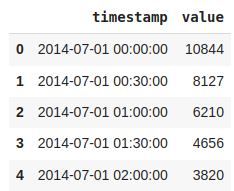
Changing type of ‘timestamp’ column to datetime and setting it as an index
nyc_taxi['timestamp'] = pd.to_datetime(nyc_taxi['timestamp'])
nyc_taxi = nyc_taxi.set_index('timestamp')
Basic Plot
nyc_taxi.plot(title="NYC Taxi", alpha=0.6)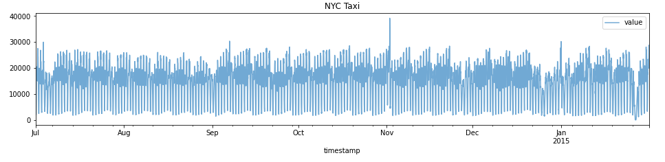
Resampling time series data
#downsampling taking daily mean
df_downsampled_daily = nyc_taxi.resample('D').mean()
df_downsampled_daily.head()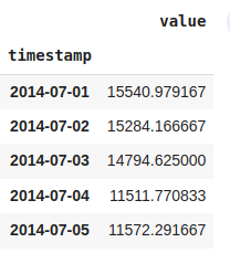
df_downsampled_daily.index[0]
df_downsampled_daily.index.freq
df_downsampled_daily.info()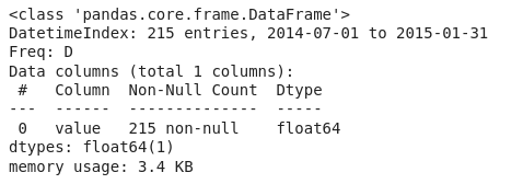
#Resampling data as 3-day frequency
df_3day = nyc_taxi.resample('3D').mean()
df_3day.head()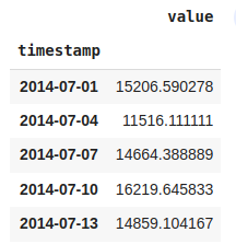
#changing frequency to 3 business days
df_3B_day = nyc_taxi.resample('3B').mean()
df_3B_day.head()
#upsampling from 30 min to 15min
df_15min = nyc_taxi.resample('15T').mean()
df_15min.head()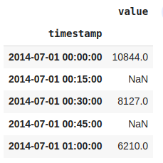
#using ffill:forward fill to replace NaN
df_15min = nyc_taxi.resample('15T').ffill()
df_15min.head()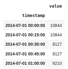
#More than one aggregation while downsampling
df_month = nyc_taxi.resample('M').agg(['mean','min','max','median','sum'])
df_month.head()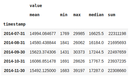
Detecting outliers using visualizations
import seaborn as sns
#daily sample
df_daily = nyc_taxi.resample('D').mean()
sns.histplot(df_daily)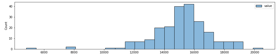
Boxplot
#using boxplot
sns.boxplot(df_daily['value'])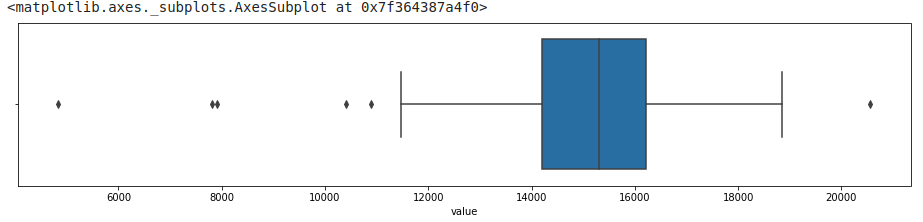
#changing the whisker from default(1.5) to 1.8
sns.boxplot(df_daily['value'],whis=1.8)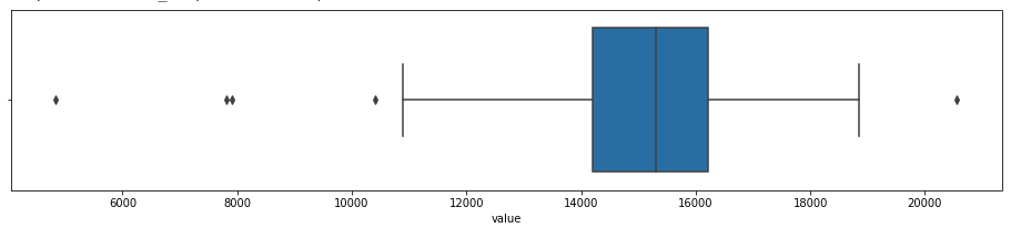
Boxenplot
They provide similar insight as to the boxplot but are presented differently. Boxen (letter-value) plots
are better suited when working with larger datasets (higher number of observations for displaying data distribution and more suitable for differentiating outlier points for larger datasets).
#boxen plot
sns.boxenplot(df_daily['value'])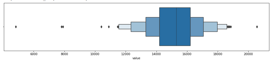
#boxen plot with different depths
for k in ['tukey',"proportion","trustworthy","full"]:
  sns.boxenplot(df_daily['value'],k_depth=k)
  plt.title(k)
  plt.show()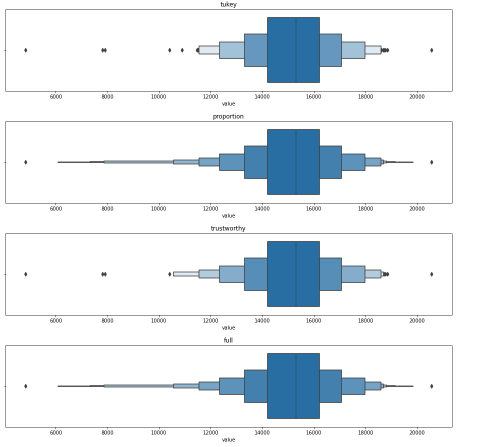
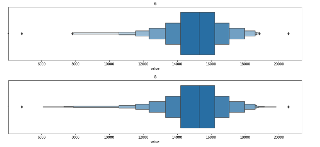
#boxen plot with different depths
for k in range(0,10,2):
  sns.boxenplot(df_daily['value'],k_depth=k)
  plt.title(k)
  plt.show()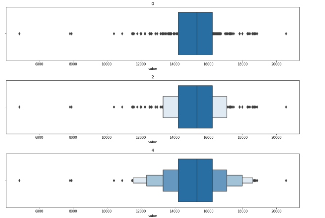
Violin plot
Violin plot is a hybrid between a box plot and a kernel density estimation (KDE). A kernel is a function that estimates the probability density function, the larger peaks (wider area), for example, show where the majority of the points are concentrated. This means that there is a higher probability that a data point will be in that region as opposed to the much thinner regions showing much lower probability.
#violinplot
sns.violinplot(df_daily['value'])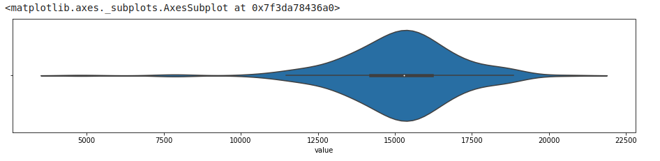
Lag Plot
Here we plot the same variable against its lagged version y axis represents passenger coun at the current time (t) and the x axis shoes passenger count at a prior period (t-1).
from pandas.plotting import lag_plot
lag_plot(df_daily)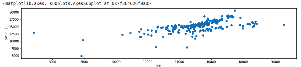
Detecting outliers using the Tukey method
Using IQR and Tukey’s fences is a simple non-parametric statistical method. Most box plot implementations use 1.5x(IQR) to define the upper and lower fences.
def iqr_outliers(data):
  q1,q3 = np.percentile(data,[25,75])
  IQR = q3-q1
  lower_fence = q1 - (1.5 * IQR)
  upper_fence = q3 + (1.5 * IQR)

  return data[(data.value > upper_fence) | (data.value <lower_fence)]
outliers = iqr_outliers(df_daily)outliers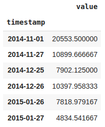
#Function to plot outliers with red x
#This function will be used in case of z-score too
def plot_outliers(outliers,data,method='KNN',
  halignment = 'right',
  valignment = 'bottom',
  labels=False):
  ax = data.plot(alpha=0.6)
  if labels:
    for i in outliers['value'].items():
      plt.plot(i[0],i[1],'rx')
      plt.text(i[0],i[1],f'{i[0].date()}',
      horizontalalignment = halignment,
      verticalalignment = halignment)
  else:
    data.loc[outliers.index].plot(ax=ax,style='rx')

  plt.title(f'NYC Taxi - {method}')
  plt.xlabel('date');
  plt.ylabel('# of passengers')
  plt.legend(['nyc taxi','outliers'])
  plt.show()
plot_outliers(outliers,df_daily,"Outliers using IQR with Tukey's Fences")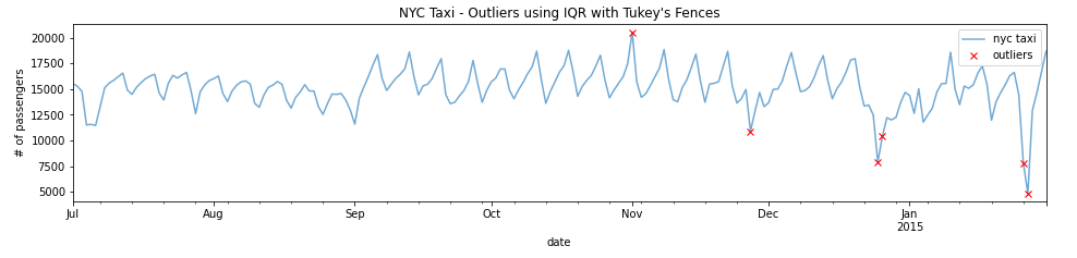
#using values other than 1.5
def iqr_outliers(data,p):
  q1,q3 = np.percentile(data,[25,75])
  IQR = q3-q1
  lower_fence= q1 - (p*IQR)
  upper_fence = q3 + (p*IQR)
  return data[(data.value > upper_fence) | (data.value < lower_fence)]
#Calculating outliers with different values of p
for p in [1.3,1.5,2.0,3.0]:
print(f'with p={p}')
print(iqr_outliers(df_daily,p))
print('-'*15)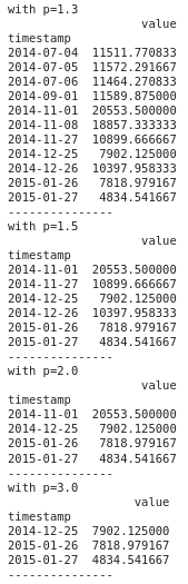
Detecting outlier using z-score


Once the data is transformed using the z-score, you can pick a threshold. So, any data point above or below that threshold (in standard deviation) is considered an outlier. For example, your threshold can be +3 and -3 standard deviations away from the mean. Any point lower than -3 or higher than +3 standard deviation can be considered an outlier.In other words, the further a point is from the mean, the higher the probability of it being an outlier.
#Create a z-score function to standarize the data and filter out the extreme values based on a threshold
def zscore(df,degree=3):
   data = df.copy()
   data['zscore'] = (data -data.mean())/data.std()
   outliers = data[(data['zscore'] <= -degree ) | (data['zscore'] >= degree)]
   return outliers['value'],data
threshold = 2.5
outliers, transformed = zscore(df_daily,threshold)transformed.head()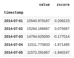
transformed.hist()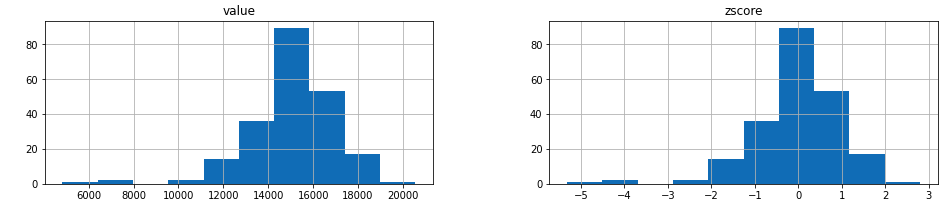
print(outliers)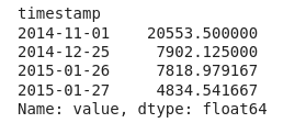
plot_outliers(outliers,df_daily,"Outliers using z-score")
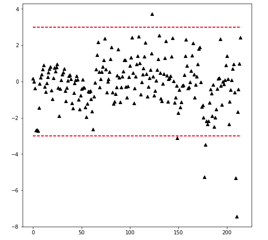
#the following function takes the standarized data to plot the data with threshold lines
def plot_zscore(data,d=3):
  n = len(data)
  plt.figure(figsize=(8,8))
  plt.plot(data,'k^')
  plt.plot([0,n],[d,d],'r--')
  plt.plot([0,n],[-d,-d],'r--')
data = transformed['zscore'].values
plot_zscore(data,d=2.5)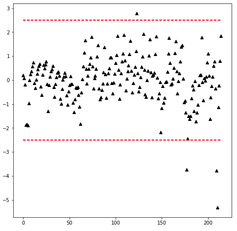
Testing if data obeys a Gaussian distribution
#testing if data obeys a Gaussian distribution
#using Kolmogorov Smirnov test
#if p value is less than 0.05, we can reject the null hypothesis i.e.  data is not normally distributed
#otherwise we fail to reject null hypothesis
from statsmodels.stats.diagnostic import kstest_normal
def test_normal(dataframe):
  t_test,p_value = kstest_normal(dataframe)
  if p_value < 0.05:
    print("Reject null hypothesis. Data is not normal")
  else:
    print("Fail to reject null hypothesis. Data is normal")
test_normal(df_daily)
Detecting outliers using a modified z-score
The modified version of the z-score works with non-normal data.


MAD = Mean absolute deviation

The 0.675 value is the standard deviation unit that corresponds to the 75th percentile (Q3) in a Gaussian distribution and is used as a normalizartion factor.
import scipy.stats as statsdef modified_zscore(df,degree=3):
data = df.copy()
s = stats.norm.ppf(0.75)
numerator = s*(data - data.median())
MAD = np.abs(data - data.median()).median()
data['m_zscore'] = numerator/MAD
outliers = data[(data['m_zscore'] > degree ) | (data['m_zscore'] < -degree)]
return outliers['value'], datathreshold = 3
outliers,transformed = modified_zscore(df_daily,threshold)transformed.hist()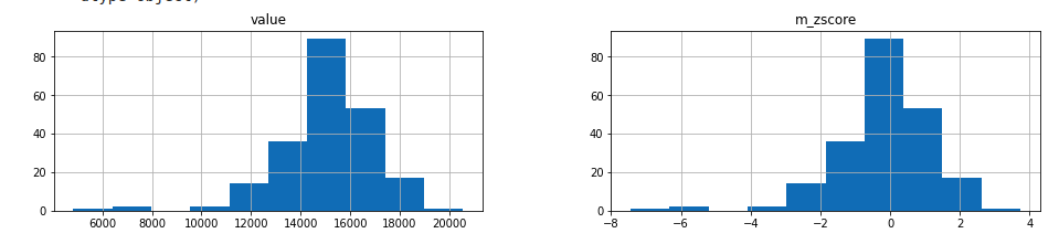
print(outliers)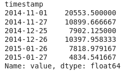
plot_outliers(outliers,df_daily,"Outliers using modified z-score")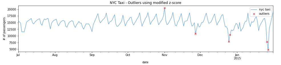
def plot_m_zscore(data,d=3):
  n = len(data)
  plt.figure(figsize=(8,8))
  plt.plot(data,'k^')
  plt.plot([0,n],[d,d],'r--')
  plt.plot([0,n],[-d,-d],'r--')
data = transformed['m_zscore'].values
plot_m_zscore(data,d=3)